

- Phone:
+86 17767255556
- Email:
a009@hzfuhan.com
- Add:
#160, Huafeng Road, Xiacheng District, Hangzhou City, Zhejiang Province, China
**The Art of Balance in a Jewelry Card**
Time:2026-09-14 Views:9 Source:FUHAN
After working in the jewelry industry for a long time, it’s easy to overlook one detail: while the jewelry itself looks beautiful under the lights, the first thing a customer sees when holding it is actually the card. Whether the card is stiff enough, the embossed text is clear, and the holes are properly aligned often determines how much this little item means to her. Today, I’d like to talk about these two gray-toned jewelry cards we have on hand.
**Restraint in Shape**
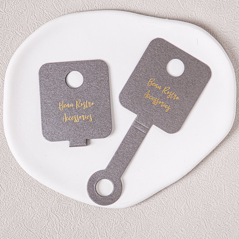
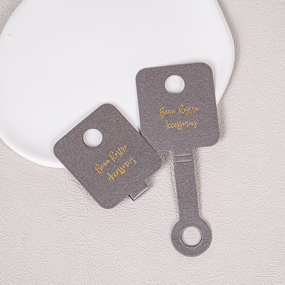
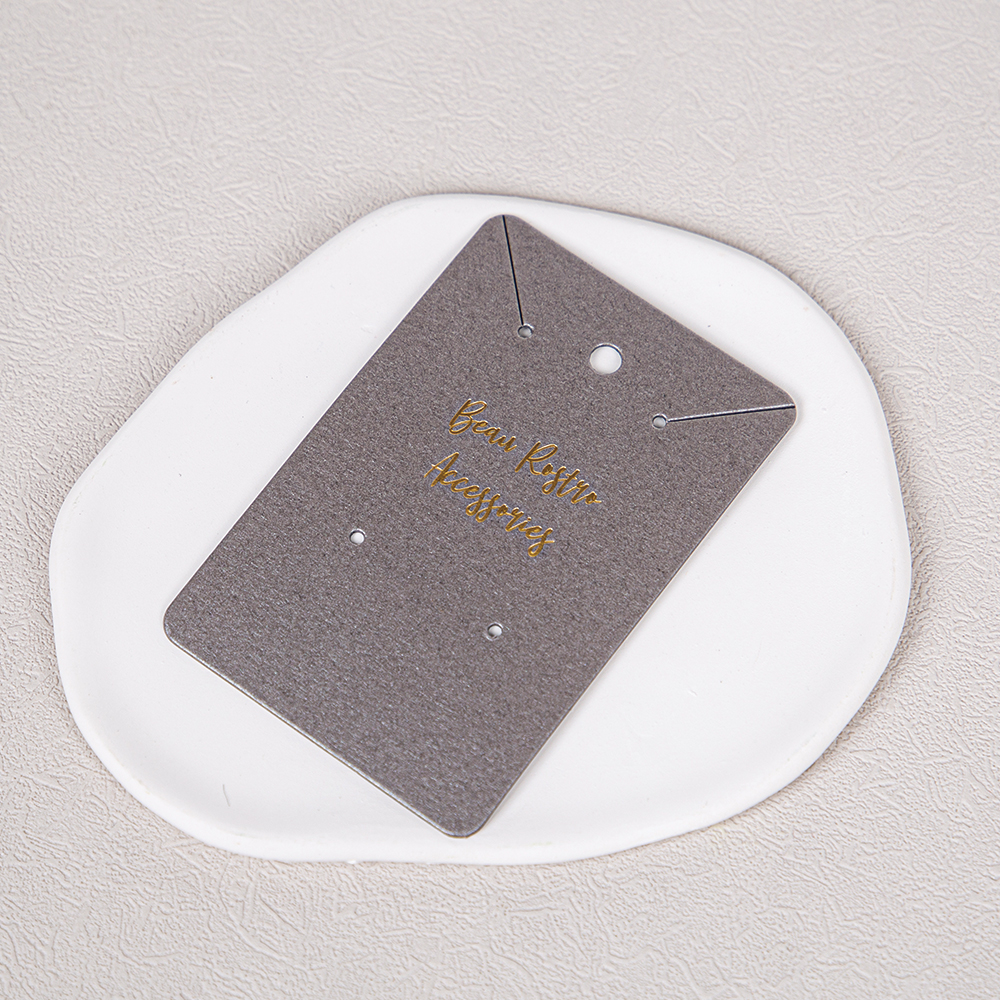
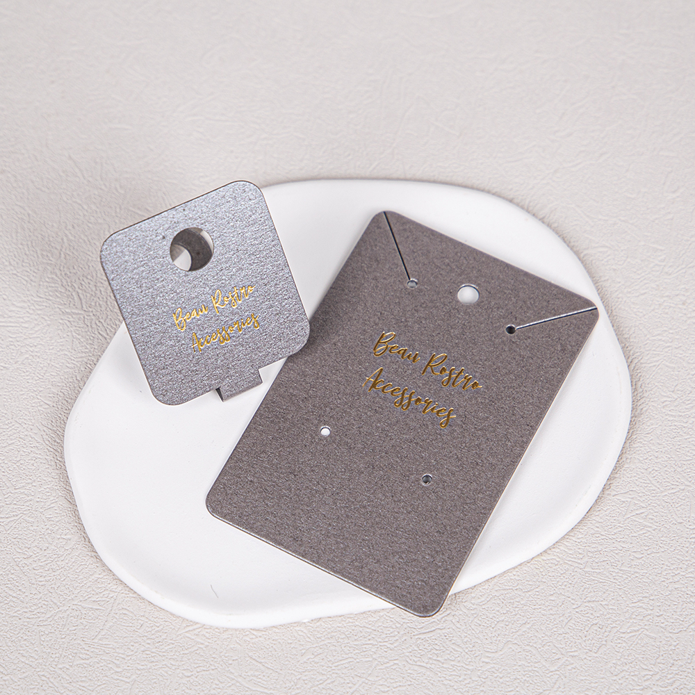
Both cards feature rounded corners, making them smooth to the touch and giving them a gentle appearance when displayed on shelves. On the left is a square pendant card with a circular hole in the center and a tab at the bottom that allows it to be securely held in a display stand or gift box; On the right is a rectangular earring card with a hanging hole and a diagonal alignment notch at the top, and two pairs of stud holes at the bottom. The shapes aren’t flashy, but every opening serves a purpose—hanging necklaces, securing earrings, or displaying items—each in its proper place, so customers don’t have to think twice.
**The Warmth in the Materials**
The card faces are made of a special gray-toned paper with a subtle textured grain—one shade leans toward silver-gray, the other toward charcoal gray—with a matte, non-reflective finish. The advantage of this paper is that it’s thick and stiff; it doesn’t easily retain creases when folded, and it feels substantial in the hand, unlike thin cardstock that bends easily when squeezed. The gray background doesn’t overshadow the jewelry, yet it sets off the small gold and silver pieces beautifully, creating a pleasing visual arrangement when displayed together.
**Attention to Detail in Craftsmanship**
The text on the card is applied using a gold foil stamping process. The brand name, written in a handwritten font, sits on the gray paper; the metallic sheen is subtle yet distinct, and up close, you can feel its textured, raised surface. The die-cut holes are precisely cut; when ear studs are inserted, there are no rough edges, and the edges of the hanging holes are clean and crisp. The rounded corners and cutouts are all machine-formed in a single step, ensuring high consistency in mass production and minimizing minor flaws like crooked holes or slanted text—details customers may not point out, but which influence their trust in the jewelry as a whole.
**From Display to Customization**
This type of card is ideal for independent designer brands, handmade studios, and online jewelry stores, and is also commonly used as an inner card for wedding favors and wedding accessories. It not only secures the jewelry during shipping to prevent rattling and scratches but can also be displayed directly on the shelf upon arrival, eliminating the need for secondary packaging.
If you’re also looking for a jewelry card that doesn’t overshadow the piece itself, feel free to share your needs with us. The design, craftsmanship, and materials can all be tailored to your brand’s aesthetic, and we support printing your logo, custom text, or patterns. From the shape of the holes to the shade of the paper, we can discuss and finalize every detail together. The right card isn’t just packaging—it’s the first quiet conversation between your brand and your customer.
-
RELATED NEWS
- ● **The Art of Balance in a Jewelry Card**
- ● Custom Luxury Jewelry Boxes | Store Your Jewelry and Preserve the Sense of Ceremony
- ● **This Plain White Drawstring Pouch: A “Fabric Home” for Small Items**
- ● Minimalist Rectangular Card Box: Embodiment of the Product’s Understated Aesthetics
- ● Soft-sheen satin ribbon with gold foil stamping—an exquisite detail hidden within the packaging
- ● Minimalist Hot-Stamped Hangtags | Conveying Brand Warmth Through a Refined Texture


